Product Design · Fintech · Interaction Design

Designing a
Risk-Aware UX
to Stop UPI Fraud

Users aren't careless. The UX is just designed for speed — not safety. This case study explores a behavioral intervention system that makes risk visible before it's too late.

UPI Payments Behavioral Design Mobile UX Fraud Systems Nudge Design
₹11K CrAnnual Fraud Losses
<3sAvg Decision Time
82%Example Social Proof Signal
01 · Problem

Speed is the product.
It's also the attack vector.

UPI processes over 10 billion transactions monthly. Its greatest achievement is also its greatest risk: instant, irreversible payments. Once sent, money is gone.

Fraud doesn't happen because users are naive. It happens because the interface gives them no signal that something is wrong. A ₹50 chai payment and a ₹50,000 phishing collect request look identical in every major UPI app today.

"The UX treats every transaction the same. Risk is invisible at the exact moment users need to see it."

Warnings exist — but they're static banners users have been trained to ignore. The real problem is not awareness. It's the absence of designed hesitation.

👁
Risk is invisible
Backend signals (new contact, unusual amount, suspicious keywords) exist but are never surfaced to the user at decision time.
⚡
One UX for all risk levels
Safe and dangerous transactions share the same interface. There is no adaptation based on context or risk score.
🔔
Warnings create blindness
Repeated generic alerts condition users to dismiss them without reading. The warning itself has become invisible.
02 · Research & Insights

What the data
actually tells us

Auditing Google Pay, PhonePe, and Paytm revealed a consistent pattern: fraud prevention is treated as a backend problem, not a UX problem. The design assumes users are already informed. They're not.

Behavioral research shows that users under time pressure (which mobile payments create by default) rely on pattern recognition, not rational evaluation. The interface needs to interrupt that pattern for high-risk scenarios.

Social proof research (Cialdini) and loss aversion studies both point to the same conclusion: specific, contextual, peer-referenced messaging dramatically outperforms generic authority-based warnings.

InsightDesign Response
Users decide in <3 secondsInterrupt before they reach the CTA
Generic alerts are ignoredSurface specific, evidence-backed signals
Risk signals sit in backendMake them visible in the UI
Social proof changes behaviorAdd peer data: "82% declined this"
Single warnings failProgressive, multi-step friction
02.5 · Early Exploration & System Thinking

Mapping the problem
before designing the answer

Before any screen was designed, the core design challenge needed to be framed as a system: when should the UX intervene, and by how much? The rough flow sketch below captures that initial thinking — moving from the current flat flow to a risk-branching model where friction scales with threat level.

Key principle established here: risk drives friction, not the other way around. Every extra step should be earned by the risk level — never applied uniformly.
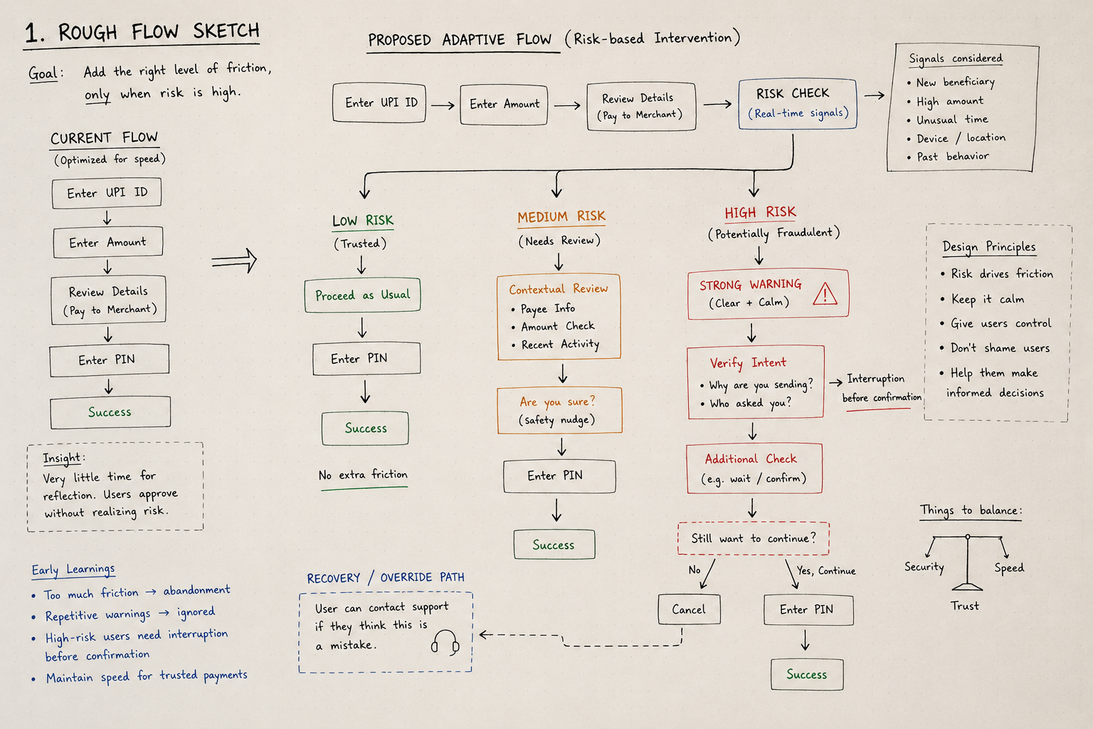
Rough flow sketch showing proposed adaptive flow with risk-based intervention branches for low, medium, and high risk transactions
Artefact 1 · Rough flow sketch — adaptive risk-based intervention model

What this sketch resolved

The current flow treats every payment identically — optimised for speed. The sketch establishes the core thesis: three distinct UX paths keyed to a real-time risk score. Low risk gets no extra friction. Medium risk gets a soft contextual review. High risk gets a hard interrupt before any confirmation.

The recovery path (user can contact support if they believe it's a mistake) was also sketched early — establishing that the system should never trap users, only slow them down.
📐
Early learnings that shaped everything
Too much friction leads to abandonment. Repetitive warnings get ignored. High-risk users need interruption before confirmation, not after. Speed must be preserved for trusted payments.
03 · Solution

A dynamic UX that
adapts to risk

The core idea: don't show the same interface to every transaction. Build a real-time risk scoring engine, then use the score to modulate how the UX behaves — from completely invisible (low risk) to full interruption with multi-step friction (high risk).

Risk Score → UX Behavior

Low Risk · Score 0–30 Normal Flow
Standard payment interface. No interruption. Preserves speed for trusted transactions.
Medium Risk · Score 31–60 Contextual Warning
Specific warning banner with the exact risk signal highlighted. Soft nudge, not a hard stop.
High Risk · Score 61+ Hard Interrupt
Full-screen interrupt → evidence screen → friction gate → final PIN warning. Four deliberate steps.

Decision Engine Flow

User Receives / Initiates Payment Request
↓
Fetch Transaction Signals (contact history, amount, keywords, timing)
↓
Risk Score Generated · 0 – 100
↓
0 – 30
↓
Normal flow
31 – 60
↓
Warning banner
61+
↓
Interrupt + Friction
03.5 · Iteration & Intervention Evolution

Three warning directions.
One survived.

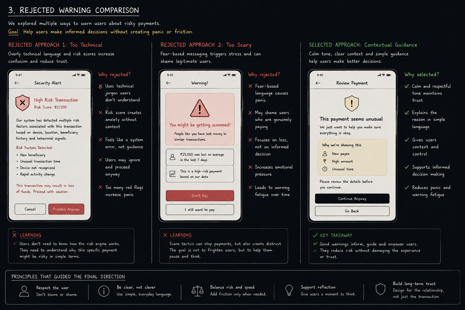
Knowing the system architecture wasn't enough. The harder question was: what should a warning actually say and feel like? Three distinct approaches were explored. Two were rejected. The reasoning behind those rejections shaped the final design more than the winning direction itself.

Rejected warning comparison showing three approaches: too technical with risk scores, too scary with fear-based messaging, and the selected contextual guidance approach
Artefact 2 · Rejected warning comparison — three directions, one selected
✕
Rejected: Too Technical
Risk scores and jargon created anxiety without context. Users felt they were reading a system error, not receiving guidance. They ignored it and proceeded anyway.
✕
Rejected: Too Scary
Fear-based language ("You might be getting scammed") caused panic and shamed users who were paying legitimately. It also built warning fatigue faster than any other approach.
✓
Selected: Contextual Guidance
Calm tone, plain language, and specific signals ("New payee · High amount · Unusual time") gave users context and control. Informs without alarming. Supports, doesn't shame.

Low-fidelity wireframe exploration

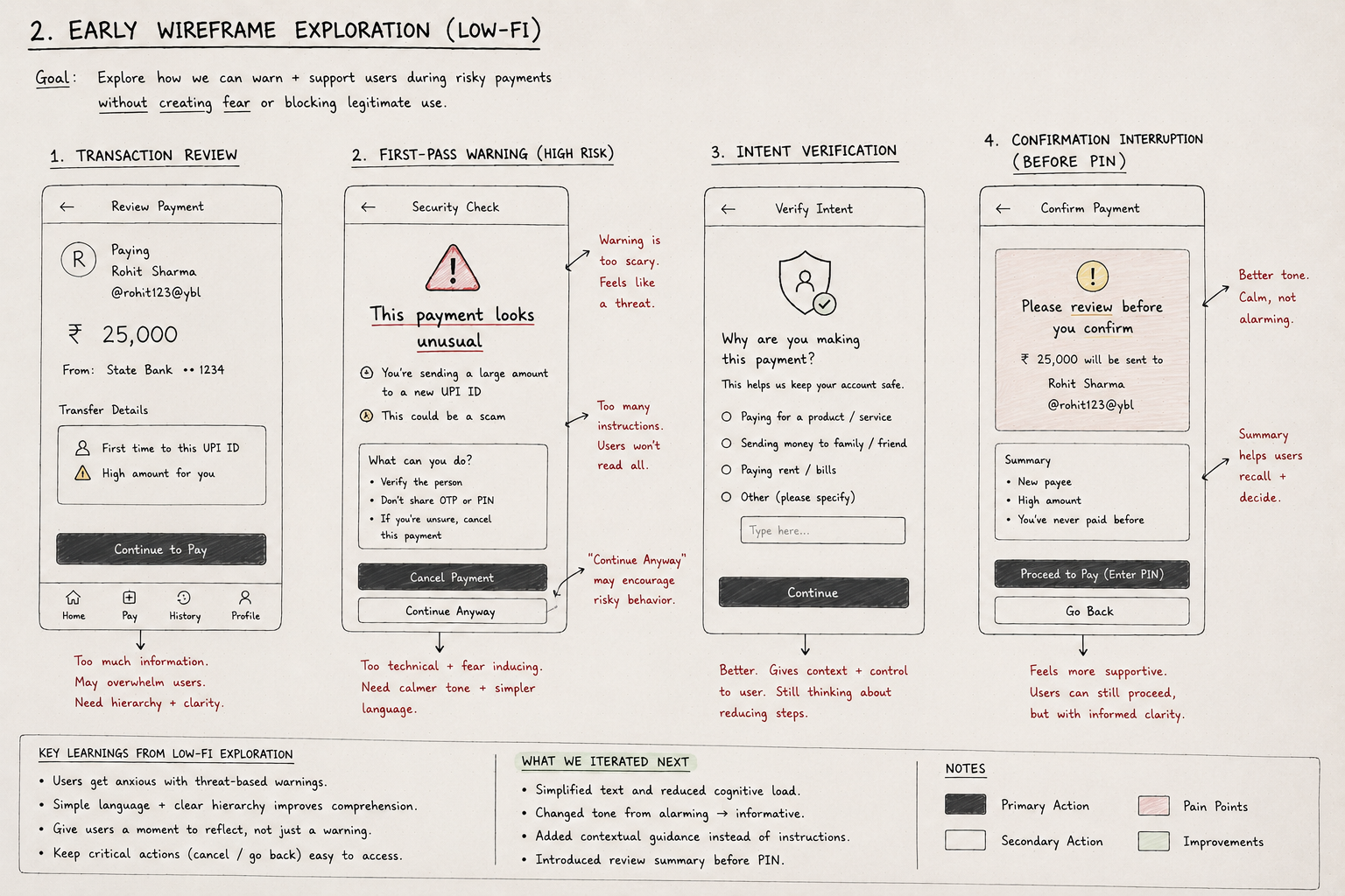
In parallel, early low-fi wireframes stress-tested how the warning journey would feel across screens. The goal: warn and support users without creating fear or blocking legitimate payments. Each wireframe surface a failure mode — which then drove the next iteration.

Low-fidelity wireframe exploration showing four screens: transaction review, first-pass warning, intent verification, and confirmation interruption before PIN
Artefact 3 · Low-fi wireframe exploration — transaction review → warning → intent verification → confirmation

What the low-fi surfaced

Screen 1 (Transaction Review) overwhelmed users with information — needing hierarchy and clarity. Screen 2 (First-Pass Warning) was too technical and fear-inducing, with instructions nobody read. Screen 3 (Intent Verification) was better — it gave context and control, but still had too many steps. Screen 4 (Confirmation Interruption) felt the most supportive — calm, not alarming, with a summary that helped users recall and decide.

🔄
Key iteration decisions
Simplified text and reduced cognitive load. Changed tone from alarming → informative. Replaced instruction lists with contextual guidance. Introduced a review summary card before the PIN step. Removed "Continue Anyway" as a primary CTA.
04 · UI Design

Four screens.
One deliberate journey.

The high-risk UX is a progressive intervention — each screen has a single behavioral goal. Together they replace a 3-second impulse with a conscious, informed decision.

Pay Request
₹ 250
To: Raju Chai Corner
UPI IDrajuchai@upi
NoteChai + Biscuit
ContactKnown
✓  Trusted contact · Low risk
Screen 1 — Normal Flow
Pay Request
⚠️ Heads up
This is your first transaction with this contact. Double-check the details before proceeding.
₹ 1,800
To: unknown@okaxis
NoteOrder payment
ContactFirst time
Screen 2 — Medium Risk Warning
🚨
High Risk Detected
This request matches known fraud patterns. Review carefully before proceeding.
First-ever transaction with this UPI ID
Amount 6× your usual payments
"KYC Refund" is a known scam phrase
Collect request (someone asking you to pay)
📊 82% of users declined similar requests
Screen 3 — High Risk Interrupt
Enter UPI PIN
⚠ You are proceeding despite high risk signals. This payment cannot be reversed.
Enter your UPI PIN to confirm
Screen 4 — Friction at PIN Entry
04.5 · Interaction Logic Exploration

Connecting system thinking
to screen behavior

Before finalising the UI, the interaction logic needed to be explicit: how does the system escalate, what can a user override, and where does the recovery path sit? These questions were worked through at the logic level — not the visual level — to ensure the final screens reflected intentional decisions, not visual guesswork.

01
State Transitions
Each risk tier maps to a distinct UI state — not just a visual skin over the same layout. Low risk: normal flow. Medium: warning banner injected into the same screen. High: full-screen interrupt replaces the payment screen entirely before any CTA is accessible.
02
Escalation Logic
High-risk intervention fires in four deliberate steps: alert interrupt → evidence screen (why we're flagging this) → friction gate (confirm intent) → PIN reminder (irreversibility notice). Each step has a single behavioral goal. No step is decorative.
03
Override & Recovery Path
Users are never locked out. If they believe the flag is a mistake, they can contact support at any point. This path was designed to be visible but not prominent — available without being an invitation to bypass the intervention.
⚖️
The core tension this logic resolves
The system must interrupt decisively for high-risk transactions — but it must never trap or shame users who are paying legitimately. The escalation path adds friction. The override path restores trust. Both are essential.
05 · Design Decisions

Why these choices,
not the obvious ones

Every design decision was made to solve one thing: getting users to pause long enough to process risk. That required deliberate choices that go against the typical "friction is bad" product assumption.

Decline as the primary CTA. Most apps put equal weight on both options. Here, the system nudges users toward safety by making decline large, prominent, and first. Proceeding requires intentional effort.

Specific signals over generic warnings. "This looks risky" is useless. "First-time contact + KYC refund keyword + 6× your usual amount" is credible. Specificity creates belief.

Social proof as evidence. "82% of users declined similar requests" is more persuasive than any institutional warning for mobile-first demographics. It references peers, not authority.

🛑
Hard Interrupt Before CTA
The full-screen interrupt fires before users see the Approve button — breaking the momentum of autopilot behavior.
🔒
Progressive Friction, Not a Wall
Four steps (alert → evidence → gate → PIN warning) feel proportionate. A single hard wall would frustrate genuine users more than deter fraud.
👥
Loss Framing + Social Proof
Combining peer behavior data with concrete loss messaging activates both social norms and loss aversion — two of the most reliable behavioral levers.
06 · Before vs. After

What actually changed

Current State
  • Identical UX for all transactions, regardless of risk
  • Generic "be careful" banners that users dismiss reflexively
  • Single-tap approval — zero friction on dangerous payments
  • Risk signals exist in backend, never shown to user
  • Decline and approve carry equal visual weight
  • No behavioral design — only passive information display
Proposed System
  • Three-tier adaptive UX that scales intervention to risk level
  • Specific, evidence-based alerts citing exact detected signals
  • Four-step friction for high-risk: interrupt → evidence → gate → reminder
  • Risk signals surfaced visually at the moment of decision
  • Decline is primary CTA — system actively nudges safe behavior
  • Six behavioral techniques embedded across the flow
07 · Impact & Trade-offs

Honest about what this costs

📉
↓ High-Risk Approvals
Designed to reduce risky payment approvals through friction and informed decision-making
⏱
↑ Decision Time
Longer hesitation on risky transactions = more conscious choices
📞
↓ Fraud Complaints
Fewer irreversible losses = reduced support burden and chargeback rate

Trade-offs

Risk
False positives will frustrate legitimate users
Rule-based scoring will occasionally interrupt genuine payments. Mitigation: user feedback loop ("This is a trusted merchant"), conservative initial thresholds, and model tuning over time.
Risk
Repeated false positives erode trust in the system
If users are interrupted on legitimate payments too often, they'll start dismissing high-risk alerts just as they do generic ones. Precision matters more than recall here.
Scope
Real-time scoring at scale is an infrastructure investment
This is an engineering constraint the design must account for. Phase 1 can run on rule-based scoring. ML-personalization comes in Phase 2 once signal data matures.
Conclusion

Fraud is a decision design problem — not just a backend one.

The signals to detect fraud already exist. The gap is the last three seconds — between a user seeing a request and tapping approve. This system closes that gap by making risk visible, decisions deliberate, and the safe path effortless.

The technology is a means. The outcome is a user who pauses, reads, and chooses — instead of tapping past a warning they've been trained to ignore.

Behavioral Design Risk Systems Fintech Nudge Design Mobile UX Fraud Prevention Interaction Design